---
title: "Mariners — A Differential Analysis"
subtitle: "Bioinformatics, by way of baseball"
author: "B. Snel"
date: today
---
<!-- Page format (theme, toc, code-fold) is inherited from _quarto.yml so the
whole site stays consistent. -->
## The pitch
Bioinformatics workflows boil down to a small set of motifs: load a matrix,
normalize it, look for structure, and call out the rows or columns that don't
behave like the rest. The same motifs work fine on baseball, and baseball has
the advantage of being immediately legible — you don't need to know what a
gene does to recognize a player having a hot month.
| Bioinformatics view | Baseball mapping |
|----------------------------------|-------------------------------------------------|
| count / expression matrix | player × stat table |
| z-scored heatmap with clustering | offensive profile heatmap |
| volcano plot | observed wOBA vs Statcast xwOBA, sized by PA |
| PCA on samples | player profile embedding, coloured by position |
## Environment
Reproducibility is handled with [`renv`](https://rstudio.github.io/renv/).
Run `renv::restore()` once and every package version below is pinned to the
lockfile checked into the repo, so the analysis renders the same anywhere.
```{r setup}
# Load all the R packages we need (ggplot2 for charts, dplyr for data wrangling, etc.)
# "here" makes file paths work regardless of which computer renders this notebook,
# and charts.R holds the chart builders shared with the landing page.
source(here::here("R", "00_setup.R"))
source(here::here("R", "charts.R"))
```
## 1 · Load the matrix
```{r fetch}
# Pull the latest Mariners batting and pitching numbers from the MLB Stats API
# (or from a saved backup if we're offline — see the note below).
# In the deploy pipeline the data is fetched once before rendering, so only
# fetch here if the saved files are missing (e.g. a standalone render).
if (!file.exists(here("data", "batting_2026.rds"))) {
  source(here::here("R", "01_fetch_data.R"))
}

# Read the saved data files into memory
batting  <- readRDS(here("data", "batting_2026.rds"))
pitching <- readRDS(here("data", "pitching_2026.rds"))

# Show the top 8 hitters by plate appearances as a formatted table
batting |> dplyr::arrange(dplyr::desc(pa)) |> head(8) |> knitr::kable(digits = 3)
```
The fetch step prefers the live FanGraphs / MLB Stats API feed. When the call
fails — no network, a rate limit, an API hiccup — it falls back to a
deterministic synthetic dataset so the rest of the notebook always renders.
(On the live site that fallback is detected and never published.)
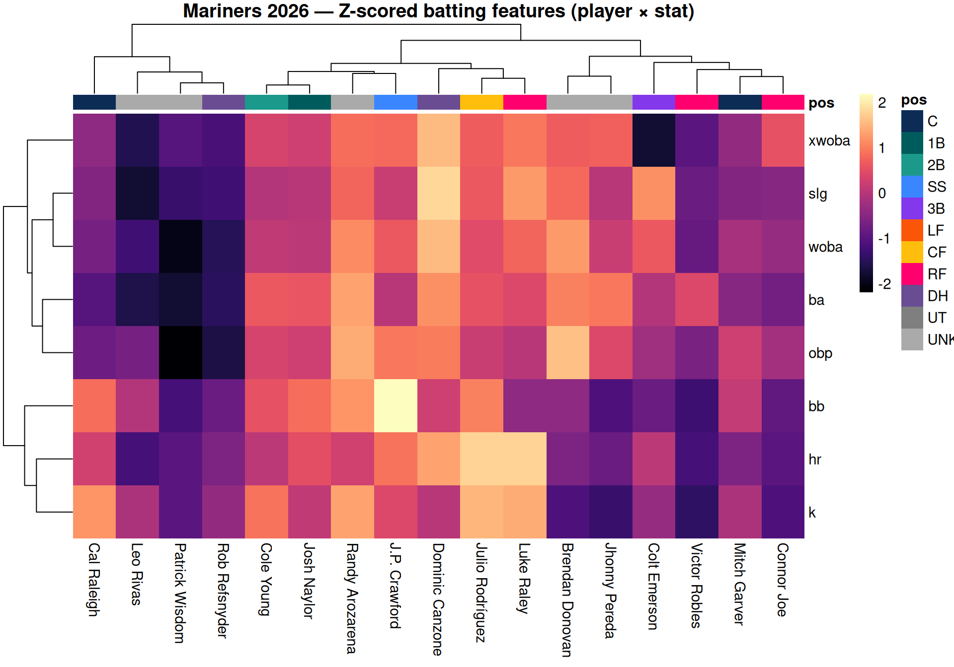
## 2 · Heatmap
```{r heatmap, fig.width = 10, fig.height = 7}
# Build the heatmap: each column is a player, each row is an offensive stat
# Colors show how far above or below average each player is for that stat
# Players with similar hitting profiles get grouped together automatically (the tree on top)
# Skip the script's PNG write (its dev.off() would break knitr's figure capture),
# then build the heatmap silently and grid.draw its gtable on knitr's device.
options(mariners.skip_png = TRUE)
source(here::here("R", "02_heatmap.R"))
grid::grid.draw(draw_heatmap(silent = TRUE)$gtable)
```
Read this exactly like an expression heatmap: columns are samples (players),
rows are features (offensive rate stats), values are within-feature z-scores.
The dendrogram on the top axis is the same hierarchical clustering you'd run
on a cohort — players with similar offensive profiles end up adjacent.
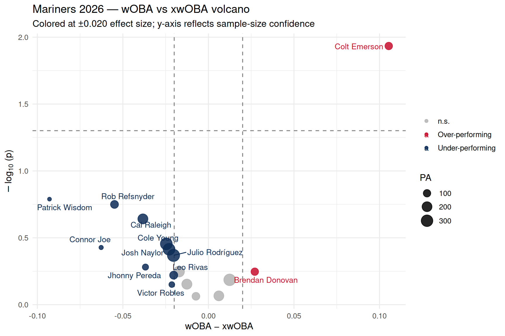
## 3 · Volcano plot
```{r volcano, fig.width = 9, fig.height = 6}
# Build the volcano plot:
#   - Left/right position = how much a player is out- or under-performing
#     what the ball-tracking data says they "should" be hitting
#   - Up/down position = how confident we are in that gap (more PAs = higher up)
#   - Dot size = number of plate appearances (bigger dot = larger sample)

# Even partway through a season, sample sizes are usually too small for the
# z-test to reach p < 0.05 at realistic wOBA−xwOBA gaps. Instead we color
# players whose gap exceeds ±0.020 — the y-axis still shows which gaps have
# the most statistical backing behind them.

chart_volcano(batting)   # shared builder from R/charts.R
```
The x-axis is **effect size**: observed wOBA minus the Statcast expected
wOBA (`xwOBA`) derived from each player's batted-ball profile (exit
velocity, launch angle, sprint speed on grounders). The y-axis is the
**significance** of that gap given the player's plate appearances so far —
small samples sit near the floor; players who have separated from their
own expected line over a meaningful number of PAs get pushed up.
The cosmetic dashed gates are at ±0.020 wOBA and p < 0.05. Points outside
those gates are the season's "differentially expressed" hitters.
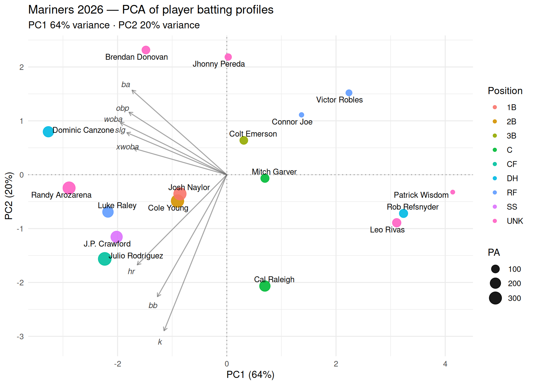
## 4 · PCA
```{r pca, fig.width = 9, fig.height = 6.5}
# Each player has 8 offensive stats (BA, OBP, SLG, wOBA, xwOBA, HR, BB, K).
# That's 8 dimensions — impossible to visualize on a flat screen.
#
# PCA ("Principal Component Analysis") finds the two most informative
# "summary axes" that capture the biggest differences between players,
# and projects everyone onto those two axes so we can plot them on a
# single chart. Think of it like taking an 8-dimensional cloud of points
# and finding the best camera angle to photograph it in 2D.
#

# PC1 (x-axis, 59% of variance) — Overall offensive quality

# Left = better hitters (the woba, xwoba, slg, obp arrows all point left)
# Right = weaker hitters (Leo Rivas, Rob Refsnyder — low across the board)
# This is the single most important axis: it captures nearly 60% of all the variation between players
# PC2 (y-axis, 20% of variance) — How they get their value

# Up = contact-oriented, low-strikeout hitters (Connor Joe, Brendan Donovan — they put the ball in play)
# Down = power-and-strikeout hitters (Cal Raleigh, Julio Rodríguez — the k and hr arrows both point down)
# So the two axes together tell you: "how good is this hitter?" (left-right) and "what kind of hitter are they?" (up-down).

# A few examples reading the chart:

# Luke Raley (far left, middle) — good hitter, balanced between power and contact
# Cal Raleigh (right, far bottom) — below-average results so far, but the profile is all power and strikeouts
# Randy Arozarena (far left, slightly below center) — productive hitter leaning toward the power side
# Connor Joe (top center) — contact-first, doesn't strike out, but not much power either

source(here::here("R", "04_pca.R"))
p   # the PCA biplot built by the script, drawn inline
```
Same biplot you'd produce from `prcomp()` on a count matrix: the player
scores cluster by offensive profile, and the feature loadings (the grey
arrows) tell you which stats are driving each axis. PC1 typically
separates power from on-base; PC2 picks up the strikeout/contact axis.
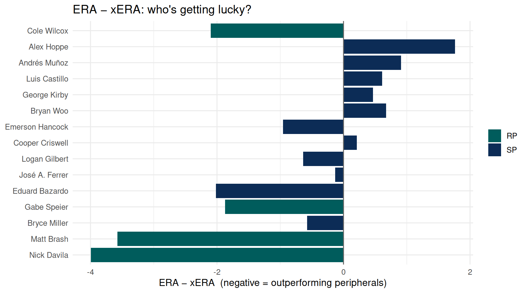
## 5 · Pitching staff as a sanity check
```{r pitching, fig.width = 9, fig.height = 5}
# ERA is the runs a pitcher has actually allowed; xERA is what the
# ball-tracking data says they "should" have allowed based on quality of contact
# A negative bar = pitcher has been better than expected (possibly lucky)
# A positive bar = pitcher has allowed more runs than his stuff would predict (possibly unlucky)

chart_pitching_luck(pitching)   # shared builder from R/charts.R
```
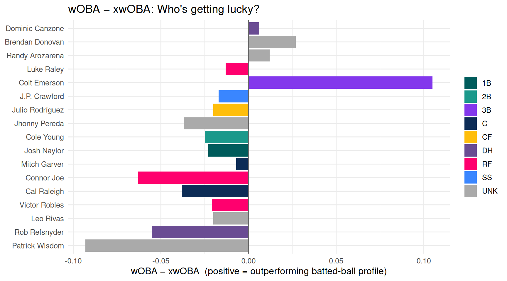
## 6 · Batting luck chart
```{r batting-luck, fig.width = 9, fig.height = 5}
# wOBA is what actually happened at the plate; xwOBA is what Statcast says
# *should* have happened based on exit velocity, launch angle, sprint speed.
# Positive bar = player is out-performing (lucky / hot streak)
# Negative bar = player is under-performing (unlucky / cold streak)

batting |>
  dplyr::arrange(woba) |>
  dplyr::mutate(player = forcats::fct_inorder(player)) |>
  ggplot(aes(x = player, y = diff, fill = pos)) +
  geom_col() +
  geom_hline(yintercept = 0, color = "grey40") +
  coord_flip() +
  scale_fill_manual(
    values = c(
      C  = "#0C2C56", "1B" = "#005C5C", "2B" = "#1B998B",
      SS = "#3A86FF", "3B" = "#8338EC", LF = "#FB5607",
      CF = "#FFBE0B", RF = "#FF006E", DH = "#6A4C93", UT = "#7F7F7F",
      UNK = "#AAAAAA"
    )
  ) +
  labs(
    title    = "wOBA − xwOBA: Who's getting lucky?",
    x        = NULL,
    y        = "wOBA − xwOBA  (positive = outperforming batted-ball profile)",
    fill     = NULL
  )
```
Same idea as the pitching chart but for hitters. Players with positive
bars are getting results that exceed what the ball-tracking data would
predict — a mix of genuine hot streaks and sequencing luck (e.g. hits
falling in at a higher-than-expected rate). Negative bars point to
hitters whose underlying contact quality is better than the stat line
shows — regression candidates to the upside.
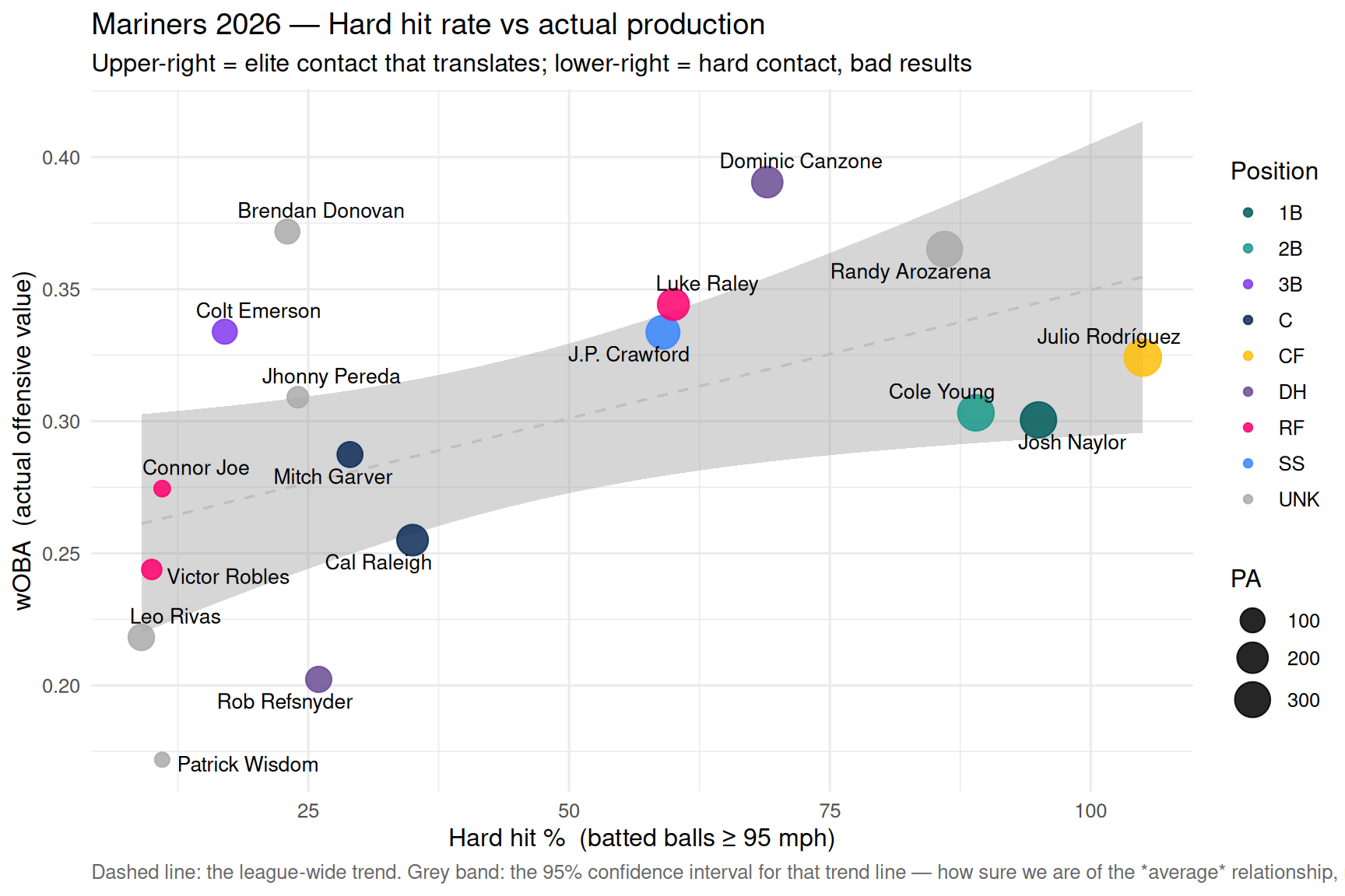
## 7 · Hard contact vs results
```{r hard-hit, fig.width = 9, fig.height = 6}
chart_hard_hit(batting) # shared builder from R/charts.R
```
This plot answers the question: **does hitting the ball hard actually
lead to better outcomes?** The dashed trend line shows the expected
relationship — generally yes, but there are outliers. Players below the
line are getting unlucky: they're making elite contact that isn't
converting into hits at the expected rate. Players above are squeezing
more value out of softer contact through plate discipline, placement,
or sequencing luck.
A note on the grey band: it is the **95% confidence interval for the trend
line itself** — how precisely we've pinned down the *average* hard-hit-to-wOBA
relationship given this small sample, not a "normal range" for individual
players. With only a dozen-plus hitters, plenty of perfectly ordinary players
fall outside it, so judge a player by how far they sit *above or below the
dashed line*, not by whether they land inside the band.
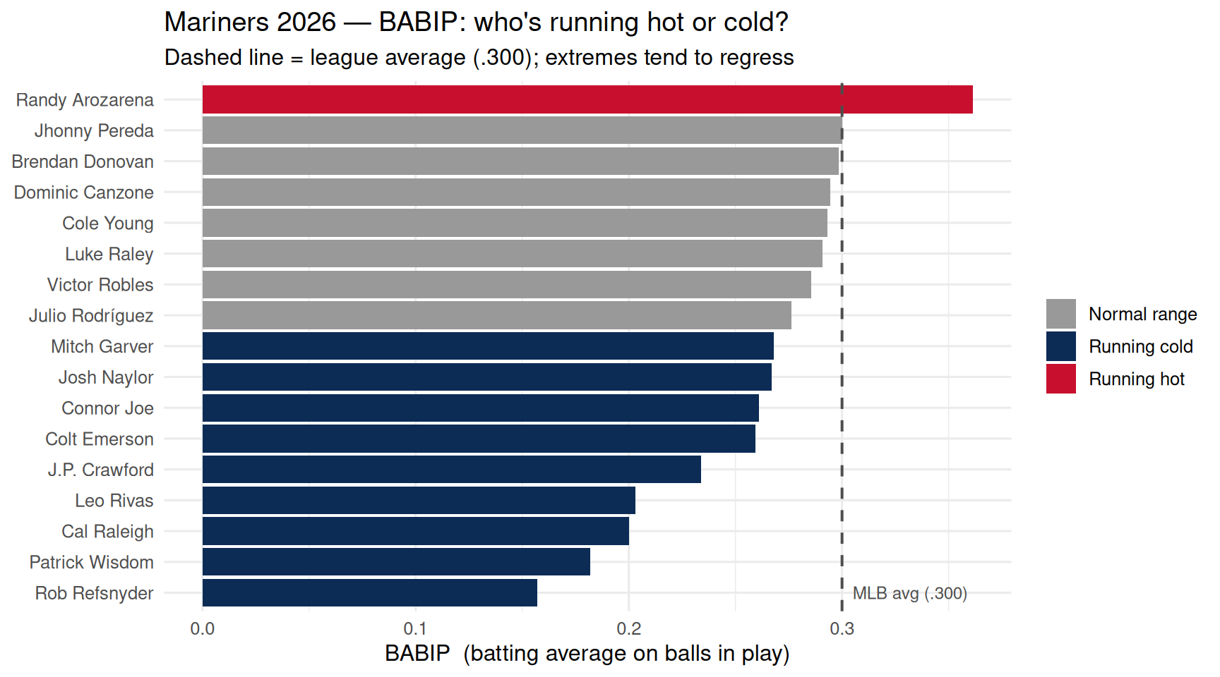
## 8 · BABIP — who's getting lucky?
```{r babip, fig.width = 9, fig.height = 5}
# BABIP = batting average on balls in play (excludes HRs and strikeouts).
# League average is ~.300 — sustained extremes are rare.
# High BABIP = hits are falling in (lucky, or elite bat-to-ball skill).
# Low BABIP = hard-hit balls finding gloves (unlucky, or poor launch angles).

chart_babip(batting)   # shared builder from R/charts.R
```
BABIP is one of the best early-warning indicators in baseball. A hitter
with a .370 BABIP isn't necessarily a better hitter — they might just be
getting favorable sequencing (bloopers, well-placed grounders). Over a
full season, most hitters settle between .280 and .320. Players in red
are candidates to cool off; players in navy are due for positive
regression. This is the same logic as identifying batch effects in a
sequencing run — the underlying biology (talent) hasn't changed, just
the noise around the measurement.
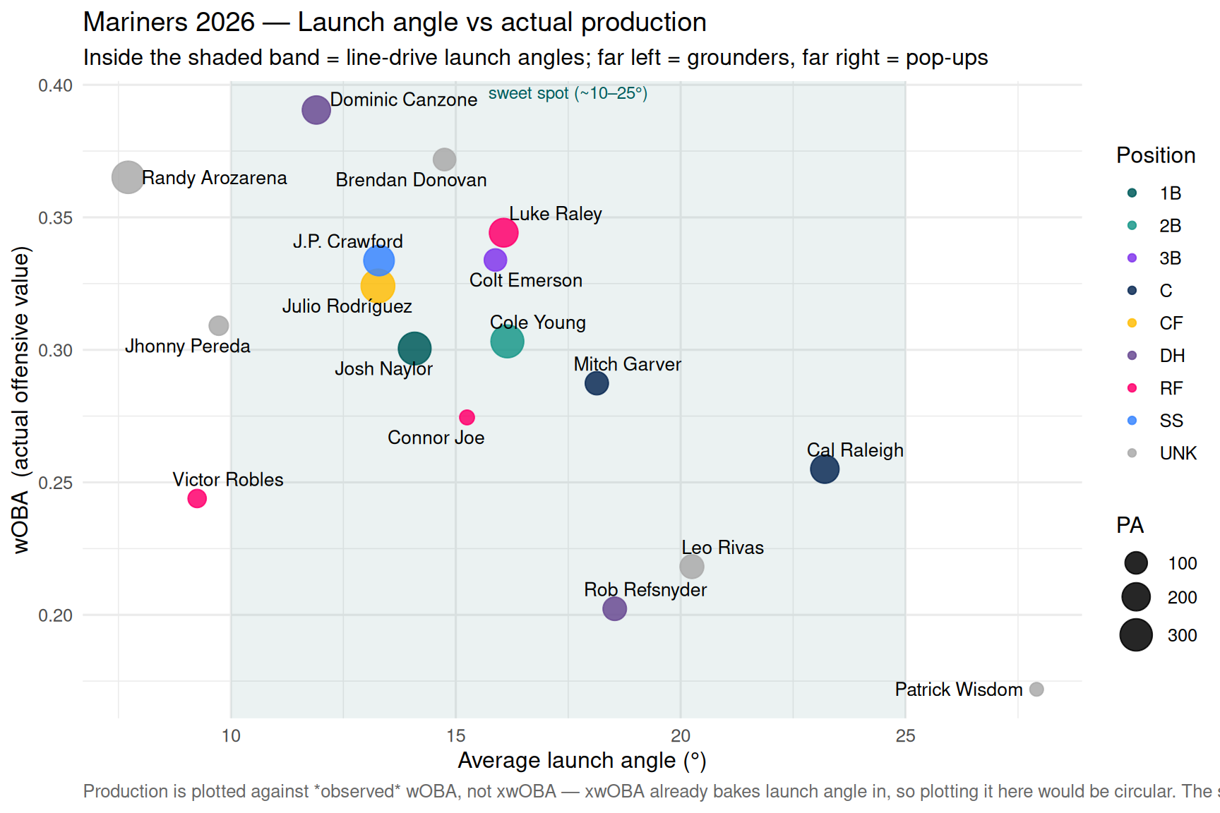
## 9 · Launch angle vs production
```{r launch-angle, fig.width = 9, fig.height = 6}
# Average launch angle (degrees) vs actual production (wOBA).
# The shaded band marks the productive line-drive window (~10–25°):
#   - far left  = too many grounders (low, weak contact on the ground)
#   - far right = too many pop-ups (steep, easy fly-ball outs)
# We plot against observed wOBA, NOT xwOBA, because xwOBA is itself built
# from launch angle — plotting it here would just be measuring the input
# against itself.

chart_launch_angle(batting)   # shared builder from R/charts.R
```
Exit velocity tells you *how hard* a ball was hit; launch angle tells you
*where it was aimed*. The two together are what Statcast turns into xwOBA —
and launch angle is the one a hitter has the most swing-shaping control over.
Unlike hard-hit rate, the relationship to production isn't a straight line:
value lives in a **sweet spot**. Pound everything into the dirt (single-digit
launch angles) and you trade extra-base hits for groundouts; get under the ball
too often (high-20s and up) and fly balls die on the warning track or in
gloves. The most productive hitters cluster inside the shaded band, where
launch angles translate into line drives.
Read it alongside the hard-contact and BABIP charts: a hitter making elite
contact (high hard-hit %) but sitting at the edges of the launch-angle band is
a swing-tweak candidate — the raw power is there, it's just being launched at
the wrong angle. One whose average angle is squarely in the band but whose wOBA
lags is more likely fighting sequencing luck than a mechanical problem.